


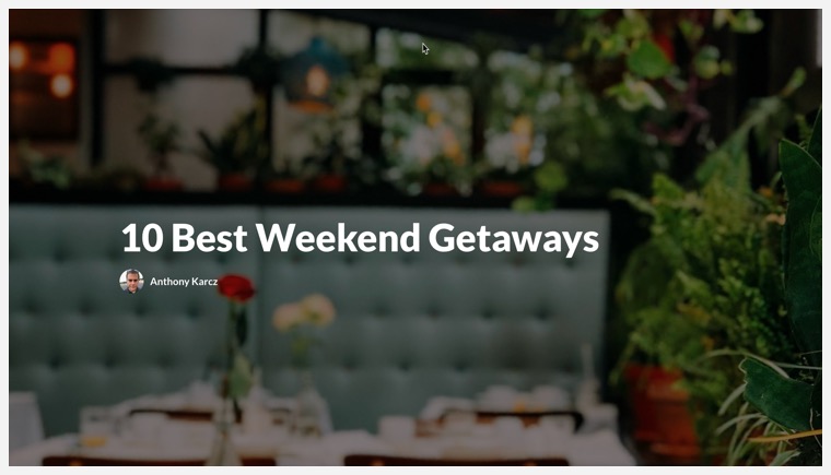
Rise 360: Our Accessibility Journey
Article Last Updated October 21, 2024
This article applies to:

We want all learners to interact as fully as possible with the courses you create in Rise 360. We know it's important to you as well. That's why accessibility is a critical part of our roadmap. Below we've put together a journal of the work we've done so far. And we'll keep this updated as we continue our accessibility journey.
Did you know—"a11y" is a numeronym created to help raise awareness of accessibility issues and causes. You can read more about the history of a11y over at the A11Y Project site.
An Accessible Scenario
October 21, 2024
Scenario blocks in Rise 360 are among the more complicated blocks to create, but they pay off by offering learners deeply layered, branching scenarios that they can return to again and again. However, there's no alt text available for the background or character image, so making them accessible meant adding a block of description before the scenario block itself. That's changed with the latest update!
Now, you can use the new Scene Description field available for the title and ending, as well as dialogue and response options. These are read by screen readers and ensure that every user can enjoy the changing backgrounds, characters, and character reactions as they happen!
The improvements we made in this update follow these WCAG criteria: 1.3.1 Info and Relationships (Level A)
On the Level
July 17, 2024
This is a big update for screen reader users (and those who create training for them)—you can now set heading levels in Rise 360!
"Aren't there already headings in Rise 360?" you might wonder. Well, yes. For the purposes of screen reader narration, lesson titles are Heading 1, headers in blocks are Heading 2, and subheaders in blocks are Heading 3. So headers do exist and are read by screen readers as expected.
So why is this update such a big deal? Simply put: You've now got options. This update lets you format plain text to be anything from Heading 2 to Heading 5. Not only do you have more options for heading levels, but you can also create a structural hierarchy that allows your learners to quickly find what they're looking for. We talk more about how to implement it in this article.
Headings benefit learners who aren't using screen readers as well. Giving your content a clear visual structure, especially when there are long sections of text, helps readers with cognitive challenges like ADHD focus.
The improvements we made in this update follow these WCAG criteria: 2.4.6 Headings and Labels (Level AA), 2.4.10 Section Headings (Level AAA)
Updates Worth Buzzing About
April 30, 2024
Wondering what we’ve been up to since our last journal entry? Over the past seven months, we’ve been busy bees, doubling down on improving Rise 360 to bring you a more robust and inclusive experience. Today, we celebrate the accessibility enhancements released since September 2023 and highlight their impact on learners.
Visibility Responsibility
We refined the screen reader experience for tab and button blocks, ensuring that tab titles are clearly visible and the entire button text is always announced—even when it’s not fully visible on the screen. Now for our next trick, we won’t make tab text disappear. That’s right—the text in tab blocks no longer changes to the tab color when you hover over it.
And for all you prebuilt theme fans, the Start button in the Apex theme is now keyboard accessible. Previously, the focus indicator skipped the Start button and went right to the lessons.
Contrast Glow-Ups
Heightened contrast results in clearer elements, which benefits learners with low vision and increases legibility and readability for everyone. That’s why we carefully reviewed the color contrast of several elements and made the following touch-ups:
- Darkened the text and icons in enhanced block settings
- Improved the contrast of hover states for quiz elements such as the Submit and Start Quiz buttons
- Ensured that the placeholder text in fill-in-the-blank questions meets color contrast guidelines when viewed in Firefox
- Tweaked the contrast of the following four elements so that they’re all visible in Windows High Contrast mode: the audio playbar, quiz results, the lock icon that appears when learners fail a quiz and must achieve a passing score to continue, and the check marks in the sidebar for completed lessons
Navigation Renovation
Think of navigation as a map that guides learners through content. What good is a map if it’s confusing? An accessible and logical navigational structure creates a better learning experience, keeping learners engaged during their journey. With that in mind, we’ve been hard at work mitigating potential areas of navigation disorientation. Here’s what’s new:
- When your microlearning is in stepped mode, you can use the Next button to navigate to the next step, which is good! However, that same Next button also let you scroll down the screen, which wasn’t intuitive for keyboard and screen reader users. Stepped navigation now has improved keyboard and screen reader support.
- Headers in the sidebar no longer obstruct lesson titles, even when your screen is at 400% zoom.
- Checkboxes for quizzes and knowledge checks are now labeled by the question and announced as a group. This ensures that assistive technologies correctly identify the question choices.
- When the Reveal Answers quiz setting was set to "Show Incorrect Answers with Feedback," NVDA screen readers revealed the correct answer. (Oops!) We've now ensured that only incorrect answers and question feedback are announced, as requested.
- The table structure in chart blocks now follows a logical reading order.
Text Flexes
Why, yes—this update is all about text! If you love additional context like we do, we’ve got great news: Tooltips displayed to learners are all dismissible, hoverable, and persistent.
You can also now highlight and copy the marker title and description text in labeled graphics.
Speaking of highlighting, we corrected the semantic structure of checkbox lists so you can left-click and drag the checkbox text to highlight words without marking the checkbox. A new option of clicking the checkbox list text to mark the checkbox is also available when you need it. Having a larger area to select elements is especially beneficial for learners with motor disabilities.
The improvements we made in this update follow these WCAG criteria: 1.3.1 Info and Relationships (Level A), 1.4.3 Contrast (minimum) (Level AA), 1.4.13 Content on Hover or Focus (Level AA), 2.1.1 Keyboard (Level A), 2.5.8 Target Size (Minimum) (Level AA), 1.3.1 Info and Relationships (Level A)
Less Motion in the Ocean
September 11, 2023
Being a human-centered organization, we take it seriously when our customers reach out about accessibility issues. Recently, someone let us know that "bouncy" animations in Rise 360 quizzes were causing them distress. Those animations are meant to keep the quiz in an optimal viewing spot on the screen but, depending on scroll view and browser size, they can become overly pronounced and possibly trigger serious physical reactions such as vertigo.
We acted immediately, targeting the quiz animation, as well as the pulsing animation associated with unvisited labeled graphic items (pulsing animations can also cause distress). We determined that the quickest way to release a solution was to add the prefers-reduced-motion css media query to them. This way, when a user has reduce motion or remove animation settings enabled on their device, the animation doesn't process.
We take every accessibility issue seriously, but when an issue can also cause physical harm, we can't afford to wait. We addressed this issue in less than a month and are actively exploring ways we can globally support reduce motion settings.
The improvements we made in this update follow these WCAG criteria: Animation from Interactions (Level AAA) 2.3.3
Summertime Soiree
July 26, 2023
It's hot outside, so why not chill out with some cool Rise 360 accessibility news!
Theme Contrast Control
This handy new feature (found in Theme > Color) lets authors ensure that their training content meets accessible color-handling requirements for learners with low vision at a 4.5:1 ratio.

From left, Auto, Dark, and Light contrast settings
You can manually select light or dark contrast but the real a11y win is when you select Auto. This enhances cover pages, lesson headers, and navigation buttons. As you can see in the image above, when selected, light text automatically appears on dark colors and vice versa.
Boring Bullets Begone
We've also made improvements to block elements that are tied to theme color (like the bullets in bulleted lists). Just like the text in lesson headers and navigation buttons, when a graphic element in a block uses the theme color and also uses a symbol or text, the contrast is automatically adjusted to preserve readability.

I Can See (the Cover Photo Text) Clearly Now
Cover photos also go a contrast glow-up recently with the addition of a light/dark overlay. Select Light to display dark text on a lightened image…

…or Dark to, you guessed it, show light text on a darkened image.
You can even adjust the overlay percentage manually to increase or decrease the contrast.
Does it Come in Black?
Finally, we've made a slight but important adjustment to our black text. It's now "true" black (that's hex code 000000 for all you graphic designers). This helps improve accessibility conformance for all your training.
The improvements we made in this update follow these WCAG criteria: Contrast (minimum) 1.4.3 (Level AA), Non-text Contrast 1.4.11 (Level AA)
Unblocked Blocks, Lost Labels Found
February 24, 2023
Spring is just around the corner and we're charging forward into sunny days and warmer temperatures with three major accessibility updates.
Screen Reader Announcement Labels
Screen reader announcement labels are hidden labels used by, you guessed it, screen readers to describe user-interface elements like buttons and links. Translating these along with your other labels is essential to ensure maximum accessibility for all learners.
These labels have always existed in Rise 360, but there hasn't been a way to translate them. That's changed with the new Screen Reader Announcement tab. Now, you can easily modify accessibility labels in Settings just like any other label. Even better, when you export your labels for translation, screen reader announcement labels are marked with an a11y tag so that they're easy to find.
Knock a Few Chips Off the Ol' Blocks
We've been working diligently since the release of the Rise 360 VPAT to make all of our blocks conformant to WCAG 2.1 standards. Now, we can knock one more off the list—process blocks are accessible.
We took special care with process blocks to create a smooth learner experience. If you're interacting with the block via keyboard, you can logically tab your way through the interface. The focus remains on the Next button in interactions, and screen readers announce the title for the current step. That way, learners can decide whether to tab through and interact with the step content or advance to the next process step.
We also improved accessibility for quote blocks! The keyboard experience for quotes with links has been improved. It no longer focuses on the quote multiple times (previously, you would navigate to the displayed version and the version available to screen readers). This enhancement lets learners interact with the block via screen reader without extra chatter.
The improvements we made in this update follow these WCAG criteria: Keyboard 2.1.1 (Level A), Focus Order 2.4.3 (Level A), Headings and Labels 2.4.6 (Level AA), Name, Role, Value 4.1.2 (Level A)
Back in a Flash
December 5, 2022
What's better than having one flashcard block accessible? Having both flashcard blocks meet accessibility guidelines!
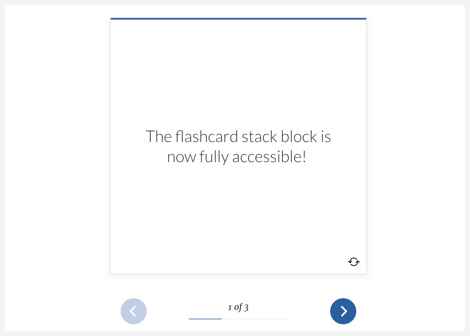
In October, we made improvements to the flashcard grid block but were still working on its block-mate. We've now brought those improvements to flashcard stack blocks so that they're also WCAG 2.1 conformant. Like grids, stacks have better screen reader support and are fully keyboard navigable.
When we started this effort, we quickly discovered that there weren't any accessible flashcard designs out there. So we made our own. Robert Pearce, one of our senior software engineers, developed a solution, then partnered with Microsoft's accessibility experts to hone the design. After extensive testing, we were able to bring this innovative solution to Rise. We hope this effort will help lead the way for other organizations.
We've made other, non-flashcard, improvements to Rise accessibility as well.
- Opening links in a new tab changes the context of the page, which people with visual impairments may not immediately realize. With this update, screen readers announce the link with the additional instruction that it opens in a new window. It's a small but important change that brings that element into better conformance with WCAG 2.1
- The "hamburger menu" (the three-lined icon at the top of the sidebar in courses) is now first in tab order if you don't skip directly to content. It's logically followed by the sidebar, which it controls. It also stays fixed to the top of the course so users always know where to access it. In addition, the hambuger menu icon and the exit course link (for LMS exports) now pass WCAG 2.1 contrast requirements so that they're always visible.
The improvements we made in this update follow these WCAG criteria: Contrast (minimum) 1.4.3 (Level AA), Non-text Contrast 1.4.11 (Level AA), Keyboard 2.1.1 (Level A), Focus Order 2.4.3 (Level A), Focus Visible 2.4.7 (Level AA), Name, Role, Value 4.1.2 (Level A), On Input 3.2.2 (Level A)
More Than a Flash in the Pan
October 5, 2022
If you guessed from the title that this update would be about flashcards, you get a gold star!
Flashcard grid blocks are now WCAG 2.1 conformant, with improved keyboard and screen reader support. Screen readers announce when you're on a flashcard flip button, and there's a helpful mouse hover tooltip that's accessible for keyboard-only users. You can also highlight and copy flashcard text. While we were at it, we resolved an issue where the flip button sometimes overlapped the scrollbar in Windows.
Also, with the new themes feature, we changed how we display text on flashcards, looking at how much space characters occupy rather than just how many characters there are. It makes for a cleaner experience that's easier to read.
How good are the new flashcard grid block improvements? Our Fable tester (Fable hires individuals with disabilities to test and offer feedback on sites) gave the new flashcard block a 100% score! They said that flashcards were easy to understand and navigate and added that the screen reader experience was "a delight."
The improvements we made in this update follow these WCAG criteria: Meaningful Sequence 1.3.2 (Level A), Sensory Characteristics 1.3.3 (Level A), Contrast (Minimum) 1.4.3 (Level AA), Keyboard 2.1.1 (Level A), Focus Order 2.4.3 (Level A), Focus Visible 2.4.7 (Level AA), Name, Role, Value 4.1.2 (Level A)
End-of-Summer Edition
September 19, 2022
It's been a busy summer! So busy, that we didn't have a chance to catch our breath and let you know what was going on in regards to accessibility in Rise 360. Let's fix that with a rundown of everything we've accomplished since May!
Improved Timeline Blocks
Interactive blocks can be a challenge for screen readers to parse properly. That's why we went back and greatly improved the screen reader performance for timeline blocks. It's a much cleaner experience overall. Timeline blocks are still announced as a group, but now it's a semantic list, because essentially it's a series of events. Even better, each card in the timeline block isn't announced separately and the extra tab stop has been removed; this caused needless chatter. For visual learners, timeline cards now have discernible borders in Windows High Contrast mode.
But That's Not All
In addition to improving the experience of interactive blocks, here's everything else that we've done this summer. Take a deep breath, it's a lot!
- We've updated the page title for the browser window. Now screen readers announce it as lesson title, then course title, then Rise 360 so that the main purpose of the page is shared first.
- To clean up the accordion block experience for screen readers, we no longer announce the plus and minus signs separately.
- The Lesson progress indicator now has a fully accessible tooltip that's available to mouse, keyboard, and screen reader users. Interact with it to see if the lesson is unstarted, the percentage complete, or complete.
- Interactive tab blocks now use the recommended interaction behavior for greater accessibility.
- Labeled graphic blocks have two new enhancements! For keyboard users, the tab order for labeled graphic blocks now follows a more logical left to right, top to bottom order. Also, when a screen reader encounters a labeled graphic marker, it now announces the marker and reads its title.
- Screen readers consistently announce caption text in image galleries.
- The course logo gets marked as a decorative element so that it's not read by screen readers.
- The borders of the search field and the Start/Resume Course link are now visible in Windows High Contrast mode.
- When using a screen reader in a course exported to LMS, the window now shows the course title (rather than the URL). Screen readers announce "Loading Course" as the course launches to give learners context.
The improvements we made in this update follow these WCAG criteria: Captions (Prerecorded) 1.2.2 (Level A), Non-text Contrast 1.4.11 (Level AA), Keyboard 2.1.1 (Level A), Headings and Labels 2.4.6 (Level AA)
Feedback is Fundamental
April 7, 2022
No, really, it is! After all, when you take a quiz or answer a knowledge check, knowing why an answer is right or wrong is nearly as important as getting it correct in the first place. In this update, we've improved feedback performance in screen readers so that it's clear to users when they're in the feedback field. We've also improved functionality for those using Android Talkback, allowing them to interact with the feedback text.
Oh, and one quick dip into the world of Windows high contrast mode (which we talked about last week), we've made it so that the continue block's border and that bullets in the bullet block are visible as expected.
The improvements we made in this update follow these WCAG criteria: Non-text Contrast 1.4.11 (Level AA), On Input 3.2.2 (Level A), Error Identification 3.3.1 (Level A)
Contrasting Opinions
March 31, 2022
There's a very clear rule when it comes to accessibility and non-text elements in an interface: they must have at least a 3:1 contrast ratio between the element and the background. Now, there are contrast checkers and utilities that we use to help ensure the Rise 360 interface meets that ratio. But when users employ something that fundamentally changes baseline contrast, like Windows High Contrast mode, it gets harder to maintain that golden ratio.
Harder. But not impossible.
In this update, we've continued the work started earlier this month, ensuring that interface elements are easily visible, even if you're employing a high-contrast system setting.
In Windows High Contrast mode, we adjusted the following items so that they're not washed out in light or dark contrast modes.
- Sidebar selected lesson
- Course hamburger menu (those three little lines in the upper-left-hand corner)
- In quote and gallery blocks, the next and previous arrows
For the following interface elements, we increased or, in some cases, eliminated hover contrast:
- Course Overview
- Start/Resume course button
- Details button
- Sidebar
- Search/Close Search icons
- Hyperlinks
- In Scenario blocks, the continue button
- In quote and gallery carousel blocks, the slide selection icons and previous and next arrows
We also removed an unnecessary tooltip that appeared when hovering over the lesson progress icon.
And this is just the beginning. We're dedicated to ensuring that everyone can easily use Rise 360, no matter how they meet us. We'll be back soon with even more improvements!
The improvements we made in this update follow these WCAG criteria: Non-text Contrast 1.4.11 (Level AA), Headings and Labels 2.4.6 (Level AA), Focus Visible 2.4.7 (Level AA)
Fine-Tuning
March 4, 2022
There's a point when you're working on something, anything, where you've got a few big parts squared away but haven't yet started the next round of big changes. You want to move forward, but there are smaller bits that you need to get just right before you do.
We've been busy for the past month fine-tuning accessibility in Rise 360, getting the small things just right and the finer details dialed in before moving on to the next big thing.
- Windows High Contrast Mode:
- When you selected a radio button (like when clicking a multiple-choice answer in a quiz) in either white or black high contrast mode, it wouldn't appear selected. We've improved radio button selection visibility in these modes.
- In white high contrast mode, the search button wasn't visible.
- On Android devices using Talkback:
- Some blocks were announced twice as users navigated through lessons.
- Decorative graphics, which shouldn't be announced, were being announced.
- We added a "close modal" label to the labeled graphic information pop-up.
- We also improved the experience with chart blocks in Microsoft Edge browsers. Now, screen readers announce the chart headers as expected.
The improvements we made in this update follow these WCAG criteria: Non-text Content 1.1.1 (Level A), Non-text Contrast 1.4.11 (Level AA), Headings and Labels 2.4.6 (Level AA), Focus Visible 2.4.7 (Level AA)
Screen Reader, Contrast Improvements, and More
January 14, 2022
This week's changes focus on improving the user experience and making it easier for everyone to access their courses, however they're interacting with Rise 360. Here's what we've been up to in these first couple of weeks of the new year.
- For screen readers, we tweaked the tab block so that hidden previous and next buttons are no longer announced and eliminated redundant landmarks.
- For contrast requirements, the audio progress track is now black so it's always clearly visible and we darkened the sidebar Search label so that it meets requirements.
- We also improved table interactions so you can access all columns of a table, even when your screen is at 400% zoom.
The improvements we made in this update follow these WCAG criteria: Info and Relationships 1.3.1 (Level A), 1.4.10 (Level AA), Non-text Contrast 1.4.11 (Level AA), Focus Order 2.4.3 (Level A), Reflow Localization and Focus Improvements
Localization and Focus Improvements
December 14, 2021
And we're back! It's been nearly a year since our last update but that doesn't mean we haven't been working on accessibility. In fact, our developers have been working behind the scenes to bring a focus on accessibility to all of our new and upcoming features.
Along those lines, we have one new enhancement and three new fixes that help us get a little closer to our goal of an inclusive Rise 360 experience.
- You can now localize the video player in one of 16 languages. This is based on the language you choose for your text labels.
- On mobile devices with VoiceOver enabled, focus would land on a hidden item after you submitted a quiz answer. Now, when you submit an answer, focus lands on the feedback as intended.
- When tabbing to the Next button, the highlight color wasn't WCAG-conformant. We've changed the behavior to make it consistent with the Previous button, which doesn't change color when tabbed to.
- We've improved the responsiveness of quizzes and knowledge checks on mobile devices so that they're easier to read.
And we're just getting warmed up. Watch this space for more details on our accessibility plans for 2022.
The improvements we made in this update follow these WCAG criteria: Contrast (Minimum) 1.4.3 (Level AA), Focus Order 2.4.3 (Level A), Language of Page 3.1.1 (Level A)
Section 508 and Improved Accessibility for Labeled Graphic Blocks
January 28, 2021
Section 508
When U.S. agencies present information and offer services, what they produce must be accessible to persons with disabilities. To ensure they’re conformant, those agencies (and folks that produce content for them) abide by the Revised Section 508 standards.
To make it easier for those working with the U.S. government, we’ve added Section 508 criteria to our Rise 360 accessibility report.
Labeled Graphic Blocks
Labeled graphic blocks are a great way to bring visual flair to your courses and let learners explore at their own pace. However, especially if paired with a white background, the default labeled graphics markers need more contrast to meet accessibility guidelines.
That's why authors now have the ability to modify their markers with a handy color picker. Found in the labeled graphic block settings, the color picker lets you quickly change the color of all your markers either by entering the hex code, using the brand color, or selecting a custom color of your choice.
Other improvements to the labeled graphic block include:
- Markers are now read as an ordered list by screen readers.
- Screen readers announce marker icons as part of the marker.
- The marker state (whether or not it’s been viewed) is also announced by screen readers.
- When you open a marker, you’ll now tab into the content first instead of the controls for a more user-friendly experience.
- Closing a marker label with the ESC key brings the focus back to the marker.
- When you navigate away from an open marker label, it closes automatically.
- With these upgrades in place, we can now say that the labeled graphic blocks are 100% accessible!
The improvements we made in this update follow these WCAG criteria: Non-text Content 1.1.1 (Level A), Info and Relationships 1.3.1 (Level A), Descriptive Labels 2.4.6.b (Level AA), Name, Role, Value 4.1.2.a (Level A)
Screen Reader Support and Our VPAT®!
December 2, 2020
In the past few weeks, we improved screen reader responses for quizzes and knowledge checks. For multiple-choice and multiple response questions, it’s obvious when learners enter list elements. Additionally, keyboard navigation makes it clear when a choice has focus. Answer reviews and reveals are now accessible to screen readers, and feedback announcements are more intuitive. The quiz results page follows a logical order with fewer distractions, making it easier for learners to understand their results.
With these latest updates, we now officially support NVDA, JAWS, VoiceOver, and TalkBack screen readers with Rise 360 courses. Our goal is to ensure that learners who rely on screen readers have as satisfying and rich of a learning experience as everyone else when exploring Rise 360 courses.
Today we also released a Voluntary Product Accessibility Template® (VPAT®) that outlines the WCAG Level A and Level AA criteria conformance for Rise 360.
With our VPAT® in place, we’re confident that Rise 360 now provides an accessible learning experience. Of course, meeting the criteria is only the first step. Our accessibility work is ongoing. In the coming months, we’ll dive deeper to make even more improvements and address the exceptions we listed in our VPAT®. We want to ensure that everyone has the best Rise 360 experience possible, no matter what.
The improvements we made in this update follow these WCAG criteria: Info and Relationships 1.3.1 (Level A), Meaningful Sequence 1.3.2 (Level A), Keyboard 2.1.1 (Level A), Focus Order 2.4.3 (Level A), Focus Visible 2.4.7 (Level AA), Name, Role, Value 4.1.2 (Level A)
Ensuring Alternate Text Is Available Where It’s Needed
September 15, 2020
Alternative text (alt text) is a key element of accessibility. With the multitude of image-based blocks in Rise 360, we made sure you can add alt text to your images and that screen readers announce that text elegantly.
First, we went through our image blocks and verified that alt text is only read once by screen readers. This includes:
- Image Centered
- Image Full Width
- Image & Text
- Text on Image
- Image Carousel
- Image Grids (2, 3, and 4 column)
- Accordion
- Tabs
- Labeled Graphic marker images (not the background image)
- Process
- Timeline
- Knowledge Checks
- Quiz
If there are images in these blocks that don’t have alt text, screen readers ignore the tag and just announce them as images or read the file name.
To wrap things up, we addressed click-to-zoom images. Screen readers now announce a zoom button for images. The interface won’t be any different for sighted users but ensures those who use screen readers have a comparable experience. When users zoom in on an image, screen readers announce the alt text associated with it for context.
The improvements we made in this update follow these WCAG criteria: Info and Relationships 1.3.1 (Level A), Meaningful Sequence 1.3.2 (Level A), Parsing 4.1.1 (Level A), Name, Role, Value 4.1.2 (Level A)
Improving Color Contrast
August 14, 2020
Most people don't give a second thought to color contrast and how it affects design. But it has a marked effect on how you and your learners approach Rise 360.
If the contrast between elements is too stark, like black checkboxes on a white background, it can make things feel a little basic. Conversely, if the contrast is too subtle, like light grey boxes on a white background, it becomes harder for learners with low vision to experience the full impact of your content.
That's why we've gone through and closely examined the color contrast and opacity of the following elements and made adjustments. They're more accessible, while still ensuring your learners enjoy the high-end design they've come to expect from Rise 360. Here's what we've done to improve contrast in Rise 360:
- Darkened the color of the X icon in the search bar
- Increased the default opacity of the text on image blocks to improve readability
- Improved the contrast of unselected step counters in process blocks
- Ensured that the “Click to Flip” text on flashcard blocks doesn't appear lighter than what you pick in block settings
- Darkened the colors for several knowledge check elements, including radio buttons, checkboxes, text field borders, and drag-and-drop borders
- Darkened the border color for the interactive elements of sorting activities
- Increased the opacity on the unselected dots and darkened the progress arrows for quote carousels
- Replaced the download icons for the attachment block with more accessible alternatives
The improvements we made in this update follow these WCAG criteria: Contrast (Minimum) 1.4.3, Non-context Contrast 1.4.11 (Level AA))
Improving Sidebar Accessibility
May 28, 2020
The sidebar is more than just a menu. It displays a list of lessons and sections and also functions as a results box when you use the search bar. We wanted to make it even easier to access the information in the sidebar when using just the keyboard or a screen reader.
Keyboard Navigation
When you use the Tab button to navigate, you should only be able to interact with the elements displayed on the screen. We made sure that you can't press Tab to access lessons hidden under collapsed section headers in the sidebar.
Also, when the sidebar itself is hidden completely by the course author, we found that you could still tab to the search field. Not only is that not accessibility conformant, but it can bypass author intent. We changed this and now you can't access the search field if the sidebar is hidden.
Speaking of restricted course navigation, if the learner is required to take a quiz to continue in a course, there are several visual cues, including a pop-up tooltip. Those tooltips now display when a user tabs to a lesson they can't yet access.
The improvements we made in this update follow these WCAG criteria: Content on Hover 1.4.13 (Level AA), Keyboard 2.1.1 (Level A), Focus Order 2.4.3 (Level A), Name, Role, Value 4.1.2 (Level A)
Screen Reader Support
Since the sidebar does so much, we wanted to make sure that screen readers properly announced each section. We labeled each individual portion of the sidebar with its true function, rather than having the entire element announced as a “menu.”
Search Field

Searching from the sidebar needed additional tweaks to make it work better with screen readers. This was tricky. After all, we're taking a section of the interface you usually use to navigate and turning it into something completely different—a search field and results list. Now, screen readers announce if the sidebar is displaying search results or the course outline.
We reworked the icons as well. The X that closes the search field was announced simply as “X,” so we gave it more context. Now, screen readers announce that button as “Close the Search Form.” Much more descriptive! We also hid the magnifying glass icon from screen readers since it's purely decorative.
The improvements we made in this update follow these WCAG criteria: Non-text Content 1.1.1 (Level A), Identify Purpose 1.3.6 (Level AAA)
Progress Indicator

As you scroll through a lesson in Rise, one thing happening in the periphery is that the “progress pie” fills up in the sidebar as you reach completion. For quiz lessons, you can glance at the sidebar and see if you passed or failed based on their icons. They're nice visual reminders when you return to a course of how far along you are and how you're doing.
Screen readers now announce the lesson title as well as the current recorded progress as a percentage. If it's a quiz lesson, the screen reader announces if you passed or failed that quiz previously.
And to support our sidebar labeling effort, all of these lessons are now listed as buttons with the necessary pressed and unpressed states.
The improvements we made in this update follow these WCAG criteria: Non-text Content 1.1.1 (Level A), Identify Purpose 1.3.6 (Level AAA)
Sidebar Control
Learners can collapse and expand the sidebar using the menu icon (☰) in the upper left corner of the lesson content. And now, screen readers announce the icon's function so visually impaired learners know what it does: “Open/Close Lesson Sidebar.”
The improvements we made in this update follow these WCAG criteria: Identify Purpose 1.3.6 (Level AAA), Name, Role, Value 4.1.2 (Level A)